'/%3e%3cg%20transform='translate(170%20205)%20scale(0.3606)'%20fill='%23111011'%3e%3cpath%20d='M497%20640H359L248%20320%20122%20640H0L256%200z'/%3e%3cpath%20d='M292.43%20640H200.8L248%20522z'/%3e%3cpath%20d='M335%200h138l111%20320L710%200h122L576%20640z'/%3e%3c/g%3e%3c/svg%3e)
Get started
What's included
Everything in Alea, in one place: what every component does without extra work, the packages, every component by category, the Figma kit, how it is tested, and what Alea Pro adds.
Built into every component
You don't wire these up: they come with each component, in every look and language.
Accessibility
- Roles, names, states and relationships set inside each component
- Focus moved and returned for overlays, menus and dialogs
- Live announcements for toasts, counts, uploads, filters and status changes
- Text tokens at AA on every surface, with a high contrast mode at AAA
- Targets of at least 24 px; status never told by color alone
Keyboard navigation
- Tab between controls; composite widgets are one stop
- Arrow keys, Home, End and type ahead inside lists, menus, grids, tabs and trees
- Escape closes the layer on top and returns focus
- Every component page lists its keys
- Visible focus rings in every look
Motion
- Named patterns built from easing and duration tokens
- Four modes: expressive, productive, reduced and off
- A motion preset for every overlay
- Reduced motion followed by default: things fade in place
- Transform and opacity only, never blocking input
Themes and brand
- Dark, light and system, per page or per area
- Four looks: Fun Lab, Graphite, Midnight and Glass
- High contrast and a plain background for any look
- brandVariables: accent, radius, density and fonts in one call
- Semantic tokens only, so a theme is one file
Languages
- Every built-in label and announcement in English and Spanish
- Your own strings for any other language
- Dates, times and numbers formatted for the locale
- Right-to-left layouts
Server rendering
- Components render to HTML on the server and hydrate in the browser
- No layout shift from styles: one stylesheet, no runtime CSS
- These docs are prerendered with the same components
Types and docs
- Every component and prop typed and described
- Props tables, specs, anatomy and tokens per component
- Live examples to copy on every page
Responsive
- Responsive props per breakpoint for layout components
- Phone patterns: drawers, bottom navigation, action sheets
- Every docs page checked at phone and desktop widths
Packages
| Package | What's inside | License |
|---|---|---|
@alea/ui250 components | The components, their styles, icons through Lucide, the kit's strings and ThemeProvider. | MIT |
@alea/motion9 helpers | The motion patterns and helpers: Presence, AutoHeight, NumberRoll, TextSwap, Reveal, MorphIcon, StreamingText. | MIT |
@alea/tokensW3C tokens | Primitives, base and semantic tokens as CSS variables, JSON and Figma variables, built from the same files. | MIT |
@alea/clinpx alea add | Copy any component's source into your project to own and edit it. | MIT |
@alea/pro72 components | Charts, DataGrid, the rich text and Markdown editors, Scheduler, MediaPlayer, Kanban, RoadmapTimeline and premium effects. | Alea Pro |
@alea/blocksBlocks and templates | Ready sections and full page templates: dashboards, lists, forms, profiles, results, landing pages. | Alea Pro |
Every component, by category
Each page documents its components with examples, props, specs, accessibility notes and its keys.
Actions 11
Typography 9
Layout 31
Forms 56
- TextField
- SearchField and PasswordField
- NumberField
- Checkbox
- Radio
- Switch
- Select
- Slider
- EmojiPicker
- WheelPicker
- ListBox
- InputGroup
- ComboBox and TagField
- Dates and times
- Form
- FileUpload
- Rating
- Color pickers
- OTPField
- Cascader
- TreeSelect
- Transfer
- Mentions
- Autocomplete
- MultiSelect
- Fieldset
- MarkdownEditorPro
- RichTextEditorPro
- Editable
Overlays 18
Navigation 27
Data display 52
- Badge
- Tag
- Avatar
- Persona
- Chat
- Comment
- MediaCard and CalloutCard
- FilterBar
- StructuredList
- ContainedList
- Drag and drop
- Table
- ListView
- Tree
- Descriptions and Statistic
- Timeline
- Carousel
- MediaPlayerPro
- Image
- QRCode
- CalendarViewPro
- SchedulerPro
- DataGridPro
- SortableList and KanbanBoardPro
- VirtualListPro
- Ribbon and Indicator
- Countdown and FormattedNumber
- Status and ColorSwatch
Charts 17
Feedback 16
Effects 38
AI 8
Workflow 12
Extras 10
For designers
Figma kit
156 component sets with the React props as variants and properties, variables in Dark and Light and in each look, 174 icons, a spec page per component and responsive templates.
Figma kitFoundations
Color, type, space and icons as tokens, with which token to use for what and the contrast of every pair.
ColorsTemplates and blocks
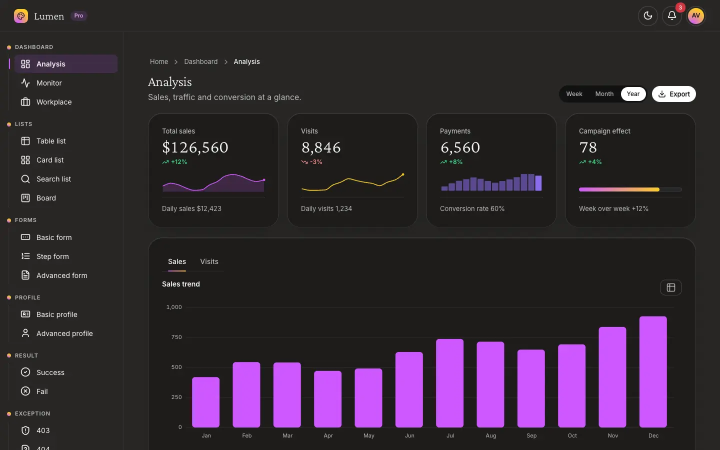
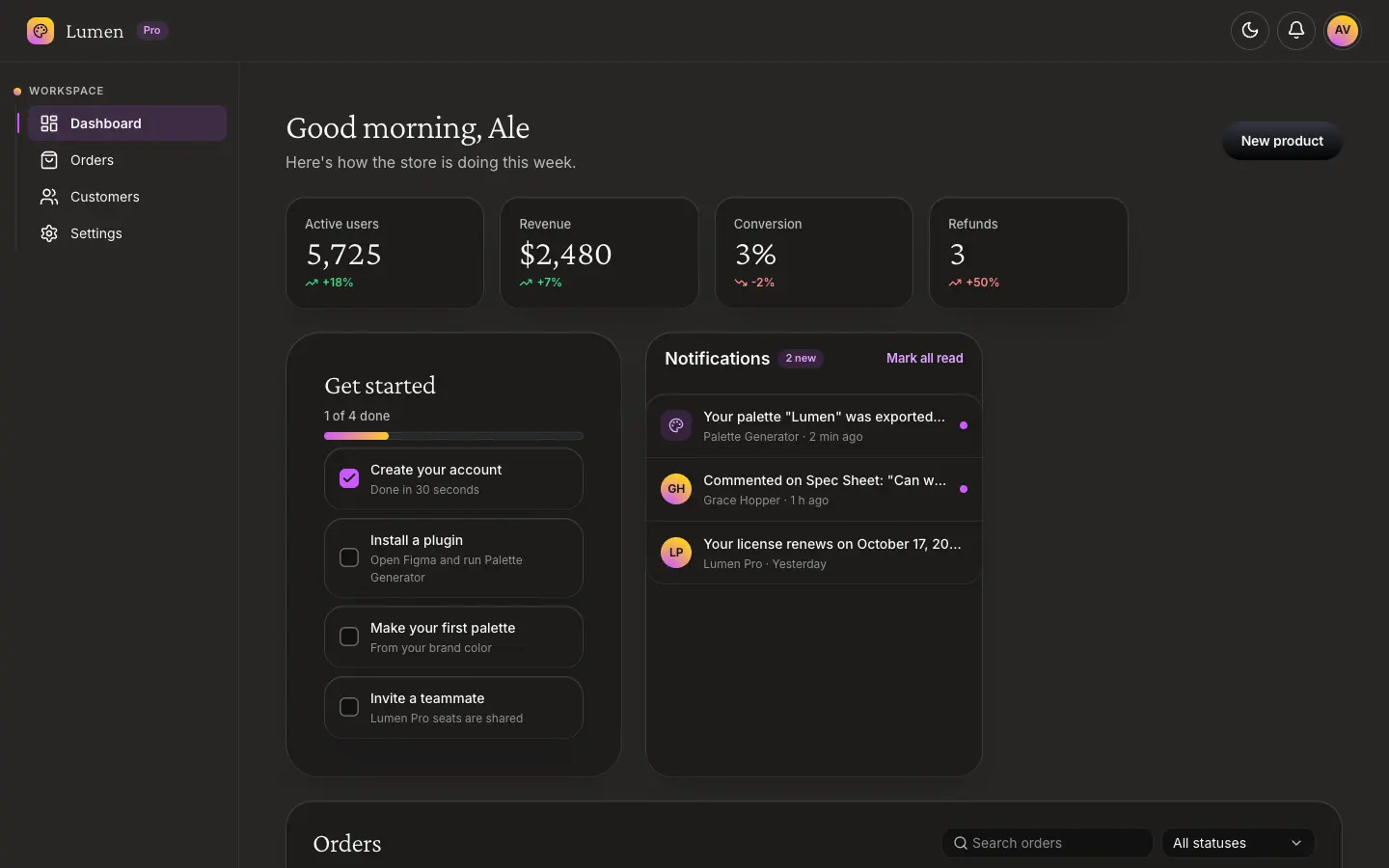
Real pages made from the components, to start a product from something that already works.
TemplatesHow it is tested
- Unit tests across the components, with an automated accessibility check
- Every docs page checked for accessibility at AA and AAA, in each of the four looks, in dark and light
- Keyboard journeys: search, dialogs, menus, tabs, selects and the mobile navigation
- A sweep of every page at phone and desktop widths for overflow and visible focus
- The Figma plugin tested against a model of the Figma file
Free and Pro
| Included | MIT | Alea Pro |
|---|---|---|
| Components, motion, tokens, CLI | Yes | Yes |
| Accessibility, keyboard, themes, looks, two languages | Yes | Yes |
| Figma kit and plugin | Yes | Yes |
| Charts, DataGrid, editors, Scheduler, MediaPlayer | No | Yes |
| Premium effects | No | Yes |
| Blocks and templates | No | Yes |
| Commercial license for client work | No | Yes |